
Early Attempts at Flavour Classification
As my personal interest in whisky flavours grew, I began exploring reviews sites in some detail, looking for commonalities and difference in how they reviewed whiskies. I was particularly interested in extracting the apparent whisky classification systems used by these reviewers. While most reviewer-defined systems were highly personal (and not necessarily evidence-based), I did notice a striking similarity of approaches – and choice of descriptors – in the reviews of major reviewers. It appeared feasible to combine these into a broad ranging flavour categorization system that would be compatible with most of the existing structures used by these reviewers.
I will describe in detail on the Methodology pages how I arrived at the most scientifically-valid method of classifying whisky flavour. But it is worth describing in a bit of detail how the early attempts at flavour classification informed this process. Note however that many of these approaches are flawed by the highly subjective approach taken (without consideration of all the variables, and without any validation or statistical justification of the results).
Dual Descriptor Headings
On many liquor sale sites, a common way to quickly categorize whisky flavours is borrowed from the wine industry. Just as it is common to see red wines described under general headings such as “light and fruity” or “rich and smooth”, you will often see similar simple dual descriptors applied to whisky. The first term is typically a relative strength indicator, and the second is some form of flavour identifier.
The main problem is with these is that the evidence base for the classification is unknown. But more generally, most whiskies of a certain type tend to fall into the same category (e.g., almost all bourbons on the LCBO are “medium and sweet” or “bold and sweet”, Canadian ryes are all “medium and spicy” or “bold and spicy”, etc.). These simple categories are thus of limited value in helping you pick a product (and the basis of their assignment is completely unknown in the first place).
The Flavour Map
For those of a more rigorous mindset, probably the most popular detailed representation of whisky flavours in recent years has involved plotting whiskies on a two-dimension grid, typically for some measure of “intensity” versus flavour.
If you search online, you will find a lot of these maps. Most of them are based on a core map developed by Dave Broom and the blenders at Diageo (for this reason, it is sometimes referred to as the Diageo flavour chart). You will find one of the most detailed explanation and description of this particular map at malts.com. But below is an open-source image for some of the data, available through Wikipedia:
 This map has the advantage of being immediately interpretable (or so it first appears). Along the x-axis (horizontal axis) is a gradient from “light” to “rich” whisky taste. The Y-axis (vertical) is (seemingly) from “delicate” to complex “smokey” whiskies. For a fuller description of these terms, please see malts.com, or Dave Broom’s The World Atlas of Whisky.
Lack of Evidence (and Other Issues …)
The main problem with this map is that the placement of the whiskies appears to be based on a highly personal assessment rather than any rigorous objective analysis. On closer inspection, you will also see that the “delicate to smokey” placement is completely dominated by geography (i.e., the Y-axis could simply have been labelled Lowland, Speyside, Highland and Islay, in sequence from the bottom up). Yet we already know that neighboring distilleries can produce very different styles.
It gets worse. From a graphing perspective, this map includes a cardinal sin – the Y-axis is not continuous! If you read through the descriptions, you will find that it is really from “delicate to complex” with no detectable smoke on the bottom two quadrants, and from “delicate to complex” with smoke in the top two. This means that heavily complex but unpeated whiskies are just below the mid-line, whereas delicate but smokey whiskies are just above it. This is clearly NOT what the casual reader would interpret for the Y-axis. In essence, this chart is composed of two completely separate graphs (the top two quadrants, and the bottom two quadrants) that should be overlayed one directly over the other – NOT placed one on top of the other.
And it doesn’t end there. The attempt to “fill-in” each of the quadrants – with equal spacing – has resulted in some very peculiar placements. For example, I don’t know anyone who thinks the Ardbeg 10yo is actually “lighter” than the Dalwhinnie 15yo or Cardhu 12yo! The problem, it seems, is that the X-axis is greatly compressed for the top two quadrants compared to the bottom two. To be more consistent, they should have made the top two quadrants “narrower” and shifted to the right (as well as super-imposed over the bottom two, of course).
A Better Way Forward
Even if you attempted all the “corrections” I describe above, the approach is fundamentally flawed by the fact that there is no objective measure justifying these two supposed axes (i.e., what, exactly, is a “light” whisky compared to a “rich” one?). As we will see later, an extensively-verified flavour component analysis, using well characterized scales and controlled vocabulary, can be used to determine proper flavour profiles through a cluster anaylsis of core features, followed by a principal component analysis.
I will get into what I mean by all that in my Methodology section later. But for now, it’s a good time to turn our attention to a more profitable area of whisky flavour analysis – identifying core flavour component scales.
Flavour Component Scales
While there have been a number of competing attempts over the years to more fully classify whisky flavours, many have involved relative ranking of individual whiskies over several individual core flavour component scales. As you might expect, the number and type of component scales has varied, but they all tend to look something like the example below, from one open-source image I found online:
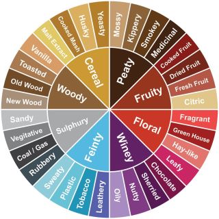 In the case above, they have identified 8 core flavour components (labelled here as woody, cereal, peaty, fruity, floral, winey, feinty and sulphury). Each of these include a number of more detailed characteristics, as shown in the outer wheel above. The point here is that you are trying to collapse the outer wheel of individual characteristics into the core flavour components of the inner wheel for each whisky in question. You do this by assigning a relative ranking on each of the core component scales, based on how many times the outer wheel components come up in reviews (either by frequency, or by some relative intensity measure).
Although 8 seems to be a popular number of core flavour components on these things, I’ve seen anywhere from 4 to 15 used in different analyses. Typically, a lower number of core components are used for analyses focused on American bourbons and Canadian blends, and higher numbers are used for Scottish single malt sites (reflecting their relatively high perceived complexity). And of course, what people have settled on as the actual component descriptors can vary (in some cases considerably, but there are a lot of commonalities overall). Nowadays, most would drop the “sulphury” group as a characteristic for example, given that the source of that contaminant has been identified and (largely) corrected.
Presentation of Results
Typically, these categorization schemes are then depicted for each whisky using some variant of the spider chart, also known as a radar chart. Using the flavour wheel above, here is how a classic young Speyside and well-aged Islay might look, based on some flavour commentaries I’ve seen for these two common whiskies:
 These charts can be very visually striking – especially when you choose very different whiskies, as I have done above. But for the most part, they are actually very difficult to compare and interpret across typical whisky ranges.
There are specific issues with angles and axes on spider plots – especially around the zero-score categories (i.e., these can be inconsistent relative to grid lines). Moreover, we all have difficulty accurately judging radial distances for relative scale intensity (although grid lines as shown above do help a bit). We also have top-down and left-right perceptual biases in how we weigh information visually (e.g., try mirroring and flipping a spherical map of the earth and tell me what you think of relative continent size). These latter two points are not limited to radar charts – they are also why pie charts are not used in scientific presentations. 😉
Like most people with quantitative methods training, I would typically prefer seeing a horizontal frequency histogram across component categories for each whisky.
As an aside, if you want to read a classic in the field, I highly recommend Edward Tufte’s The Visual Display of Quantitative Information. It’s a fabulous resource for those wanting to understand (and avoid) common pitfalls in presenting information visually.
At this point, I recommend you head over to my modern flavour classification page in the Methodology section. There I will describe below how we can use relative rankings of whiskies across a given number of scales to perform a proper clustering analysis followed by PCA.
This sound great! Have you completed the proper clustering analysis using your methodology, and if so, where can this be found?
No, I got distracted with other tasks. For now, I’ve kept a modified version of the Wishart’s cluster analysis for scotch whiskies, and rye-content classification scheme for bourbons.